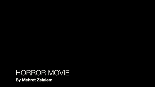
Research into Film Titles
Film titles are often the most important part of a film;
they set the tone, atmosphere and characters for the audience. The opening
sequence can either break or make an opening scene.
I looked at http://www.creativebloq.com/design/top-movie-title-sequences-10121014
and read some reviews on what people had to say about different films opening
sequences. For the BATMAN opening sequence said how it ‘’was one of the first
films I ever watched at the cinema, and I can clearly remember the impact it
had on the unnerved audience.’’ This shows us how the opening sequence clearly
sets the audience up for the rest of the film.

For the film Jackie Brown one man said ‘’by sending the
audience on a journey around a single poster with applicable typography and
motion, it's a fantastic example of setting tone with a simple idea.’’ This
shows us that it’s paramount to have the opening scene made so that it leads
into the plot of your film and hint to the audience what your film is going to
be like.

For the movie Se7en which we also watched and wrote notes
about someone commented saying that ‘’ The maniacal amount of detail that went
into the title sequence (with a vast amount of props created just for giving
the audience a few glimpses into John Doe's deranged mind), coupled with the
remixed NIN track 'Closer', make you shift uncomfortably in your seat, anxious
for what's to be unleashed, and in one fell swoop it made title design cool and
relevant again.’’ Personally I think that I am going to take ideas from this
particular opening sequence to use in my short film as it was effective and I
can make it have relevance to my plot.
Here are some of the titles available on iMovie which is the editing programme we are using to edit and piece our movies together. I think the third one works best as it looks quite professional. The first one is okay however I do not like how the main bit is in bold and the description isn't. I like the second one a lot as I think it will look goo with a fade transition. The font title I am using is called Helvetica Neue Light. The second one is called Line Lower Third but I changed the size of the description as my whole name wouldn't fit on one line. The first one is called Reveal Lower Third and the third one is called Standard Lower Third.


Here are some of the titles available on iMovie which is the editing programme we are using to edit and piece our movies together. I think the third one works best as it looks quite professional. The first one is okay however I do not like how the main bit is in bold and the description isn't. I like the second one a lot as I think it will look goo with a fade transition. The font title I am using is called Helvetica Neue Light. The second one is called Line Lower Third but I changed the size of the description as my whole name wouldn't fit on one line. The first one is called Reveal Lower Third and the third one is called Standard Lower Third.
Analysing the first draft of my film opening 'Basement' using peer feedback:
In order to gain some feedback on the shot choices, plot and initial draft of my film opening,
I produced a first draft using imovie and asked one of my peers a series of questions relating to the draft of the opening. The questions were as follows:
Please click here to see a filmed recording of the draft feedback session. There is a pause for each question to be discussed after the relevant sequences in the film opening the question relates to.
The main findings of this analysis which will inform my work going forwards are:
No comments:
Post a Comment